
Reflecting on My Tableau Iron Viz Journey: Lessons Learned and New Directions
- Jennifer Dawes
- Sep 16, 2024
- 6 min read
Updated: Jan 2
Participating in Tableau's Iron Viz competition has been one of the most exhilarating and transformative experiences of my data visualization career. Over the past few years, I’ve poured my heart into creating different vizzes, each reflecting my technical growth and personal journey. As I prepare for this year’s competition, I can’t help but reflect on what I’ve learned and what I might do differently this time. It’s also fun to note that I only recently received the scores for all my previous entries. For the longest time, I believed my analysis was lacking, but looking at the data, I now see more clearly where to focus my energy.
This post walks you through each of my entries, the stories behind them, and the lessons I’ve taken from each experience. Let's dive in!

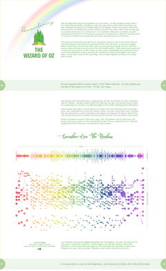


2021 - Remembering the Wizard of Oz
Scores:
Analysis: 4.56
Design: 3.64
Storytelling: 3.95
This Iron Viz submission was deeply personal. Remembering the Wizard of Oz wasn’t just a data story; it was a tribute to my family and the joy of simple childhood memories. Growing up as the youngest of three, I was close to my older brother and sister, and one of our favorite pastimes was watching musicals together, especially The Wizard of Oz. We must have watched it a hundred times, and for me, it became an escape, a comforting constant in a time of family upheaval.
Text from the Viz: "My most cherished memories are of simple things—watching The Wizard of Oz with my siblings after school, rewinding parts of the movie to analyze together. For me, this movie became more than just entertainment; it became an escape, a symbol of family unity and comfort in a time of uncertainty."
However, as I got older, life became more complicated. My siblings moved out, and my parents’ relationship struggled. My mother left our home one night while I slept, and for a few years, she was in and out of my life. During that time, I often thought of Dorothy, wishing I could click my heels together and return home to a simpler, more innocent time.
Key Lessons: This viz was all about storytelling, which I feel was one of its strengths. Feedback suggests it may have been text-heavy and my story didn't connect enough to the data. I poured my heart into the narrative, connecting personal memories with a cultural touchstone. However, the design could have used more refinement. Looking back, I would have drawn more inspiration from The Wizard of Oz itself—the vibrant colors, the whimsy, the sense of magic—to make the design stand out. While I was happy with the analysis and storytelling, the visual design didn’t match the emotional weight of the story.
What I Would Do Differently: I would focus more on harmonizing the design with the emotional depth of the story. I also would have liked to tighten the narrative, making clearer parallels between Dorothy’s journey and my own feelings of longing for home. The storytelling was there, but I feel it could have been even more powerful with better integration of the design elements.


2022 - Arts are Blooming in Ohio
Scores:
Analysis: 4.08
Design: 3.85
Storytelling: 3.82
Arts are Blooming in Ohio is a reflection of my lifelong love for the arts. From a young age, I’ve always been fascinated by colors, shapes, and patterns, and everything pointed me toward a career in the arts. My parents, however, had a different perspective, and when I shared my dreams, I was often met with skepticism. I vividly remember my dad telling me, “There’s no money in the arts.” For many years, I carried that with me, but today, we know that the arts are a thriving industry encompassing everything from visual and performing arts to teaching and broadcasting.
Text from the Viz: "At the time, my parents imagined me on a street corner, trying to sell paintings to make a living. Fast forward to today, the arts have exploded into a creative industry—an industry that includes visual and performing arts, teaching, and even broadcasting. Arts are blooming all around us."
This visualization explored the rapid growth of the arts industry, drawing parallels to my personal experiences of following my passion despite the challenges. I wanted to show how the arts have evolved and continue to thrive.
Key Lessons: In this viz, I connected personal storytelling with broader industry trends, but I think the design could have been more visually compelling. While the scores were fairly balanced, they didn’t stand out as much as I would have liked. The analysis was solid, but the storytelling could have drawn more directly on the industry insights, connecting them with more striking visuals.
What I Would Do Differently: Looking back, I would experiment with bolder design choices, perhaps focusing more on dynamic visuals that represent the creativity of the arts. The story could have used a stronger emotional hook, similar to my Wizard of Oz entry, but with a focus on how I overcame obstacles to follow my artistic passions.


Scores:
Analysis: 4.44
Design: 4.61
Storytelling: 4.12
The Love Legacy: Secrets of Longevity in the Blue Zone is the most recent and perhaps the most introspective of all my submissions. The concept of Blue Zones, areas of the world where people live longer and healthier lives, has fascinated me for a long time. As a mother of four boys and someone who lives a very busy life, I often neglect my own health. Watching a documentary about Blue Zones reminded me that it’s possible to live well and live long, even in the chaos of everyday life.
Text from the Viz:" What if I could live well and live to 100? The concept of Blue Zones, popularized by National Geographic explorer Dan Buettner, captivated me. The idea that small changes in daily habits could lead to a longer, healthier life seemed not only feasible but necessary. This visualization was a way to explore those ideas and think about my own longevity and legacy."
As I created this viz, I thought a lot about the small, meaningful adjustments I could make in my life to ensure that I’m not just living long but living well. The visualization focused on analyzing data from Blue Zones and connecting it to my health journey.
Key Lessons: With The Love Legacy: Secrets of Longevity in the Blue Zone, I was able to balance strong analysis with design and storytelling. I felt this piece was one of my more cohesive entries, with the design complementing the story and the analysis being impactful. I also learned that I’m not as lacking in analysis as I once thought! Reviewing the scores helped me realize that focusing on improving my storytelling and design could elevate my work even further.
What I Would Do Differently: Going forward, I would lean even more into the personal aspects of the story. The idea of legacy, both in terms of health and family, is something I’m passionate about. I would like to explore deeper emotional connections and use the design to mirror those sentiments even more effectively.
Looking Ahead
As I prepare for this year’s Iron Viz, I feel more grounded in my strengths and aware of the areas I want to focus on. I’m excited to push my design skills further and refine my storytelling while maintaining the strong analytical foundation I’ve built over the years. It’s been a journey of growth, not just as a data analyst but as a storyteller and artist.
This year, I’ll be aiming to harmonize all three areas—analysis, design, and storytelling—to create something that not only tells a compelling story but also visually captivates the audience. I’m looking forward to taking everything I’ve learned and putting it into practice for this year’s competition.
By reflecting on my past entries, I can see how much I’ve grown and how much more there is to explore. I’m excited for what’s next and hope my journey will inspire others to keep pushing the boundaries of their creativity and skills in the world of data visualization.
Comments